Wednesday, May 15, 2013

Twitter.


“Starting today you’ll begin to notice a simplified Twitter bird. From now on, this bird will be the universally recognizable symbol of Twitter. (Twitter is the bird, the bird is Twitter.) There’s no longer a need for text, bubbled typefaces, or a lowercase “t” to represent Twitter.”
It seems that Twitter has joined the ranks of Apple, Nike, Starbucks and Target in the club of companies that are so big that their brand is instantly recognizable without a single letter of text.
Interestingly enough, many of the illustrations that I can find of the original bird actually face to the left, though it seems Twitter played with facing him in either direction
The next step was to drop all that silly cartoon detail and revert to a silhouette look. During the process, the bird’s shape was streamlined. The feet were removed, the wings redrawn and the beak was made to be less awkwardly curved. Interestingly enough, in this step, the bird was made to look less like it was moving upwards, a step that would be reversed and taken to new heights in the next version.

Tuesday, May 14, 2013

Graphic Design


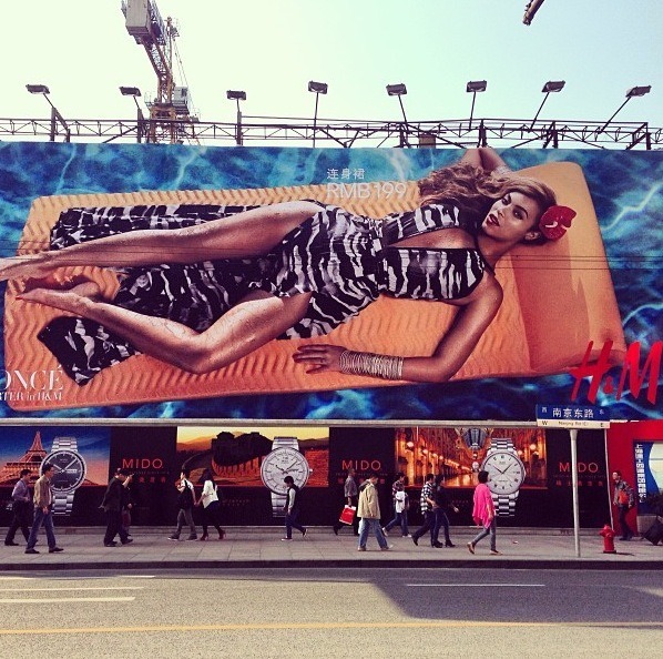
Graphic design is everywhere, touching everything we do, everything we see, everything we buy: we see it on billboards and in magazines. Over the door of your favorite stores,  websites, on mobile items and on gift certificates, on your favorite beverage and on your favorite books.

Graphic design to me is a combination of words and pictures,  photographs and illustrations that, in order to succeed, demands critical thinking from the artist who can execute the elements so they all add up to something distinctive or perhaps memorable.


Design based in this understanding of the intended audience is highly successful. Trying to design without it is like trying to communicate without knowing the language of the listener.

Monday, May 6, 2013

History of the Apple Logo


Apple logos are everywhere, iPods, iMacs, iPhones, iPads and many other ‘i’ devices. The Apple logo is one of the best and most relevant logo ever. But it was not the same as it is now.

Currently we have a simple small bitten silver/white Apple logo. But at the very beginning it was totally different. The first logo which was Issac Newton sitting under the Apple tree. On the tree a single apple shines to show that it was the one that helped Newton discover gravity.
This was the first Apple logo which had Issac Newton sitting under the gravity discovering apple tree.  The first Apple logo was designed by  Ron Wayne. But this logo was replaced by the Apple rainbow logo very fast. A shining about to fall apple lies directly above his head


This famous logo was designed by  Rob Janoff in 1976. He presented with a lot of similar logos from which Steve Jobs selected this one. According to Steve Jobs biography the other logo was simple looking apple which Steve didn’t like saying it looked like a cheery. After this logo was kept Apple kept it’s slogan as “Byte into an Apple”.

After Steve Jobs returned to Apple in 1997 the rainbow Apple logo got replaced in 1998  by the blank, and the glass themed/white logo. Jonathan Ive is said to be the person who changed the logo to make it simple and clean. When the iMac was launched it came with the new logo.
Since then it used the new ones for advertising, packaging, products and replaced the rainbow totally. Monochrome logo were used from 1998 to 2003 while after that they finally used the glass themed version of the Apple logo which we see them in all the Apple devices.


David C a r s o n


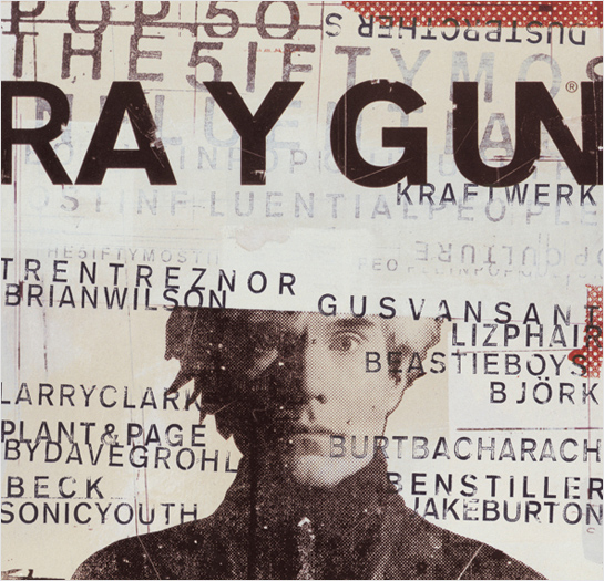
David Carson,  born September 8, 1955 in Corpus Christi, Texas, is  American graphic designer, whose unconventional style revolutionized visual communication in the 1990s. Carson came to graphic design relatively late in life.

Carson started designing in the 80s with no formal schooling in the field and has since focused heavily on typography and photography. His work became well-known in the late 80s and early 90s through skateboarding and surfing magazines. Later, he started Ray Gun Magazine, a lifestyle and music magazine, and went on to start his own design firm, David Carson Design. Carson has written and co-authored a handful of books characterizing design trends. 

He continues to be active in the surfing community. Clients include Quiksilver, Suicide Girls, Samsung, Adidas, Nine Inch Nails, Pepsi, and Toyota.
In 1989 Carson became art director at the magazine Beach Culture. 

Although he produced only six issues before the journal folded, his work there earned him more than 150 design awards. By that time, Carson’s work had caught the eye of Marvin Scott Jarrett, publisher of the alternative-music magazine Ray Gun, and he hired Carson as art director in 1992. Over the next three years, with the help of Carson’s radical design vision, Ray Gun’s circulation tripled. Because Carson’s work clearly appealed to a youthful readership, corporations such as Nike and Levi Strauss & Co. commissioned him to design print ads, and he also began directing television commercials.

After leaving Ray Gun in 1995, Carson established David Carson Design, with offices in New York City and San Diego, California. The firm was instantly successful and attracted well-known, wealthy corporate clients. In 1995 Carson produced The End of Print: The Graphic Design of David Carson (revised edition issued in 2000 as The End of Print: The Grafik Design of David Carson), the first comprehensive collection of his distinctive graphic imagery.


Sunday, May 5, 2013

Project 4 - Disney's Caribbean Beach Resort!


Sooo, for the next and last project, I decided to do it on Disney's Caribbean Beach Resort (CBR). I was thinking about something I have a lot of knowledge on and experience with and why not? I worked for Disney back in August of 2011 and was lucky enough to work at the CBR as a Bell Service Dispatcher. For this post I decided to give some background information on the resort and some cool facts!
Opened on October 1, 1988, Caribbean Beach Resort was Disney World's first mid-priced ("moderate") resort. It's gone through several renovations over the years, and is just as beautiful and relaxing as it was back then. It's in Disney's Epcot Resort Area, meaning Epcot is just a short drive away. It is the largest resort on property and I was lucky enough to work there!

Caribbean Beach Resort has about 2,000+ guest rooms arranged into 6 villages, Trinidad North, Trinidad South, Martinique, Barbados, Aruba, and Jamaica. These villages all have different Caribbean colors at the shores of Barefoot Bay. The village has either 3 or 6 buildings housing guest rooms. There are plenty of little pathways, sitting areas, and little surprises! Trust me, I used to get lost half the time I would be sent out to complete a task I was given, but I am still alive! 
CBR Logo
Each resort has a unique theme to it. From the fonts to the overall design of everything. CBR is an island themed resort. The font was very smooth and nothing extra. I believe the everything looked the way it did was because it was supposed to make you feel like you are on the islands and no worries, which it did.


Monday, April 29, 2013

Andrew Kim.


Designer Andrew Kim gained a ton of attention last year with "The Next Microsoft", in which he rebranded all of Microsoft's entire line of products: Windows 8, the Surface, Windows Phone, and even Microsoft Office.

It highlighted all issues that Microsoft is guilty of, along with a few sublets ones as well. Enough to make many wonder why the company doesn't just hire Kim, so he can help set things right.
Well, that's just what has happened. Kim has just announced that Microsoft is his new boss. "I can’t talk about the details of how things fell into place but the choice became obvious. I'll be designing for Microsoft as of summer. I promise that I’ll make the my greatest work ever while I'm there."
Kim is fairly sparse on the details, but as evidenced by the big bold letters that kicks off the announcement, it will be related to the Xbox.
This summer, Microsoft is expected to officially unveil their new home console, whatever it might be called. Everyone has been calling it the Xbox 720, but rumors point towards it just being called Xbox, and will represent a massive philosophical shift. Instead of being just a game system, it's expected to a machine that will completely take over one's living room and become the centerpiece of one's digital lifestyle. So anything that lofty will need some fairly impressive and bold branding. Which makes the hiring of Kim such a smart move.

Sunday, April 28, 2013

Project 3 facts.


Of the more than 1 million people in the U.S. infected with HIV, nearly half are black men, women and children  even though blacks make up about 13 percent of the population. AIDS is the primary killer of African-Americans ages 19 to 44, and the mortality rate is 10 times higher for black Americans than for whites. For the project, I decided on doing my poster on HIV/AIDS awareness within the African American community. I grew inspiration from my job, The Mocha Center. 

At the MOCHA Center, we pride ourselves on our ability to effectively respond to the emerging needs of our communities through dynamic programming. All of our services are conducted in a culturally sensitive manner that is both confidential and non-judgmental. Additionally, services are provided in a manner that emphasizes wellness, individual responsibility, increased awareness; while promoting self-efficacy through the ongoing support of our professional staff and volunteers.

So for a blog post, I decided to post up a few facts for a post.

  • Black men represent 31 percent of all new HIV infections in the United States. 
  • In 2010 (14,700) and accounted for 70 percent of new HIV. 
  • The rate of new infections among black men was the highest of any group by race and sex.
  • The vast majority (72 percent) of infections among black men were among MSM (men who have sex with men).
  • By age, the largest percentage (38 percent) of new HIV infections among black males in 2010 occurred in those aged 13–24 years, much higher than the proportion of new infections.